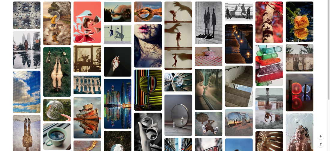
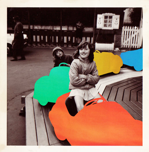
GOOD MOODBOARD ON REFLECTION!
Distorted Reflection
Antonio Gutierrez
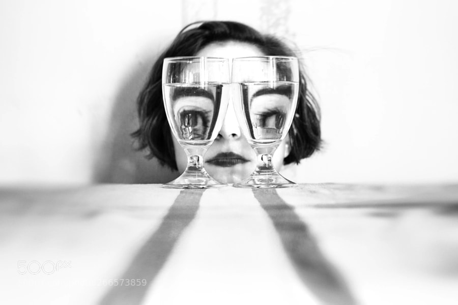

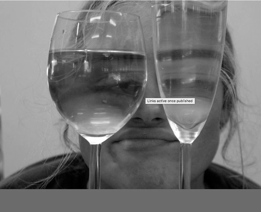
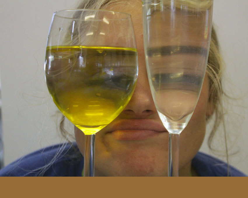
Antonio Gutierrez is a photographer from Spain. This artist uses distortion in an original and clever way, by positioning two rounded drinking glasses in front of the models eyes so they appear bug-like or parts of the face so that the model is distorted. This result is an almost fantasy like image of person with exaggerated features. It shows that the images are well thought through, as in the image on the left the glasses have been filled to the same level with water and placed without any distance from one another,
GOOD ARTIST RESEARCH!
First Response
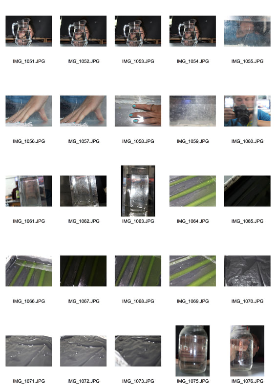
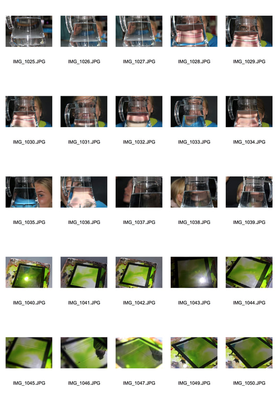
My intention for this shoot was to capture a distorted image through a glass of water, enlarging one specific facial feature.
|
|
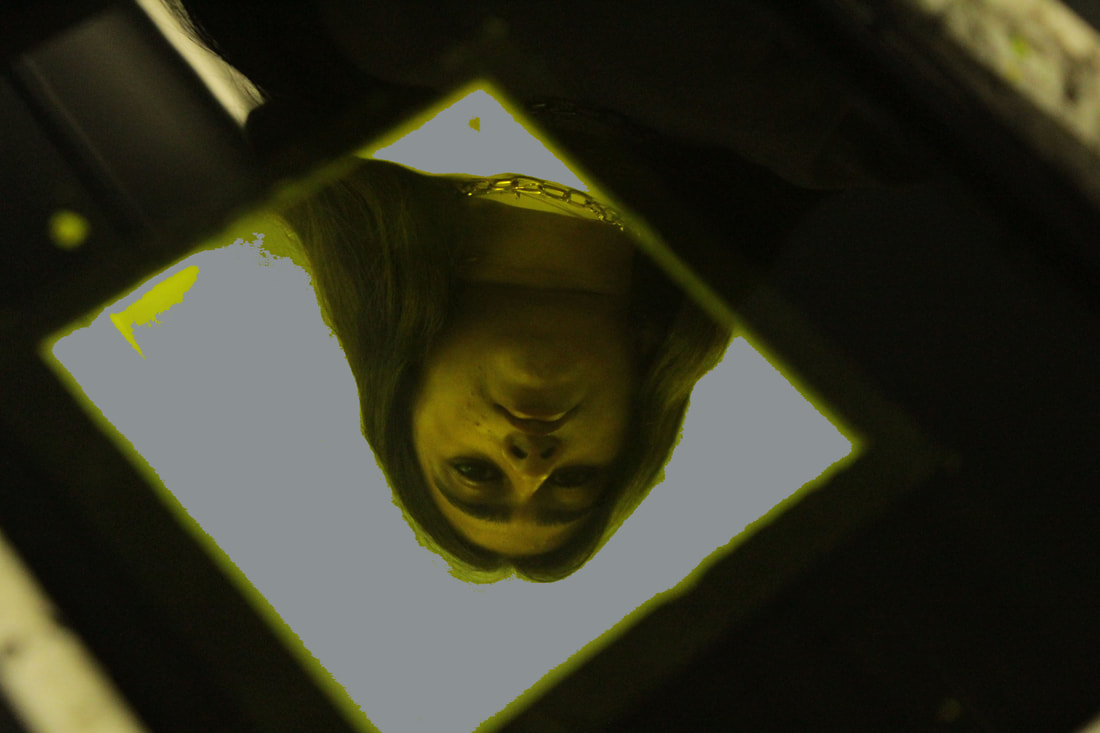
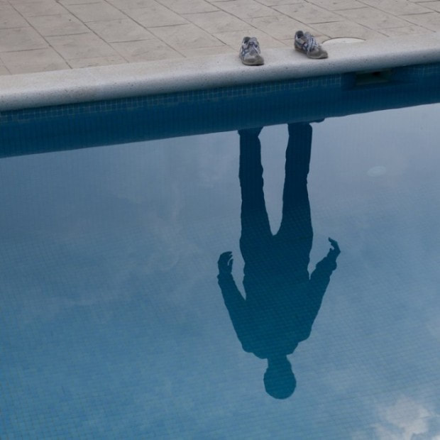
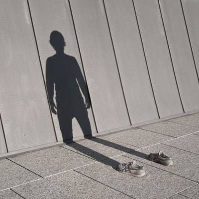
In this task I was required to take distorted reflections in water. This task links to the theme of Antonio Gutierrez work as it shows the reflection of people through jugs and glass. My images expressed my intention to capture reflection however i feel as if none of these images are strong as some are blurry and don't have a concept. Therefore as a result I am going to do a second response to distorted reflection. SO EXPLAIN THAT AS A RESULT OF WHAT YOU'VE SAID, YOU NEED TO UNDERTAKE A SECOND SHOOT.
Second response
|
|
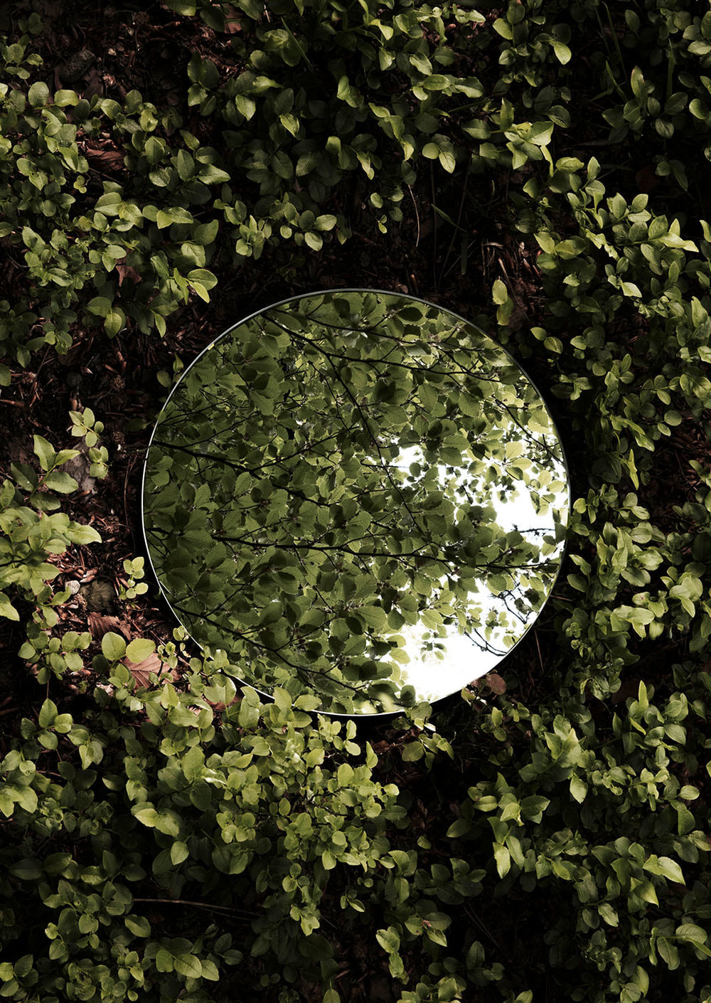
These are my favourite images from my shoot as I feel these best reflect Gutierrez work. For the image in the centre I used a big sheet of white paper so therefore the viewer won't get distracted by the background and focused on the two different shaped glasses full of clear and yellow water. The fact that the glasses have different levels of water and are different sizes create a non symmetrical image which is more intriguing image. The other two images are very similar except I photoshopped a colour of dark grey on the mirror instead of yellow.
LET'S SEE YOUR PHOTOSHOP EDITS AND THE BEFORE AND AFTER IMAGES TOGETHER. ALSO, ENLARGE YOUR BEST IMAGES A BIT MORE SO WE CAN PROPERLY SEE THEM.
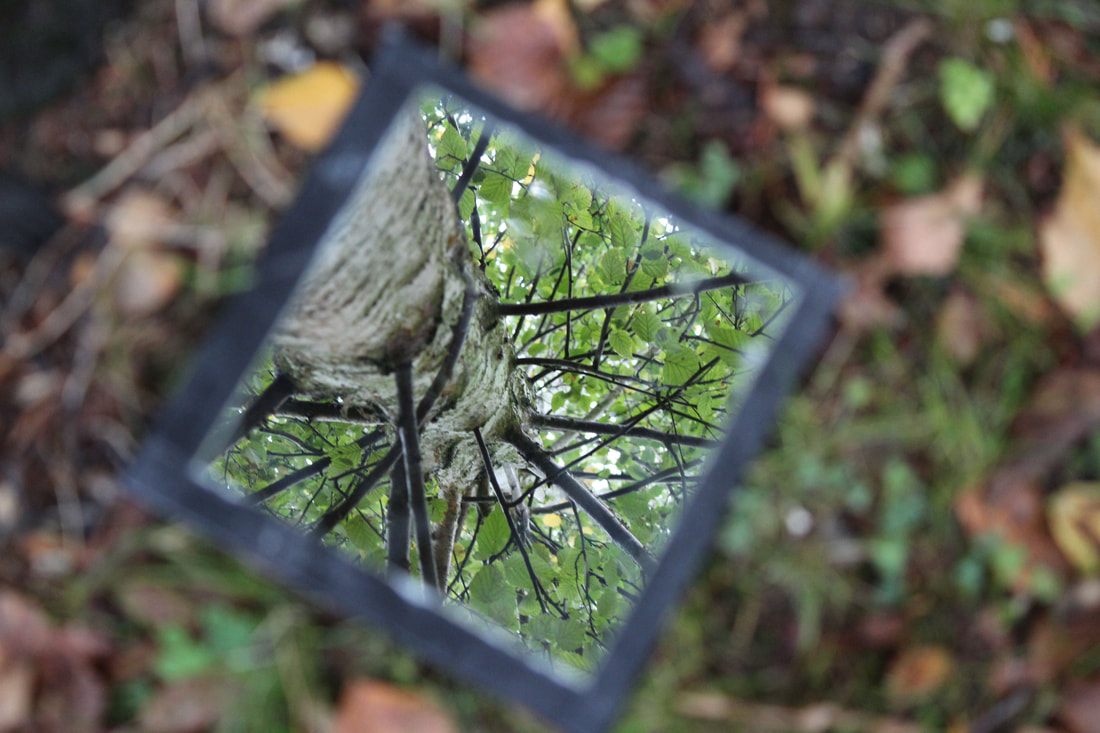
Mirror reflections
Sebastian Magnani
Magnani was born in 1985 in Switzerland. He discovered photography whilst training as a media designer in 2006. Five years later he decided, in 2011, to turn his passion into a profession. Magnani has won quite a few awards in the last seven years and still enjoys what he is doing today. I like Magnani work as the mirror reflects what approve although you cannot see it, its almost like your seeing two images at once.
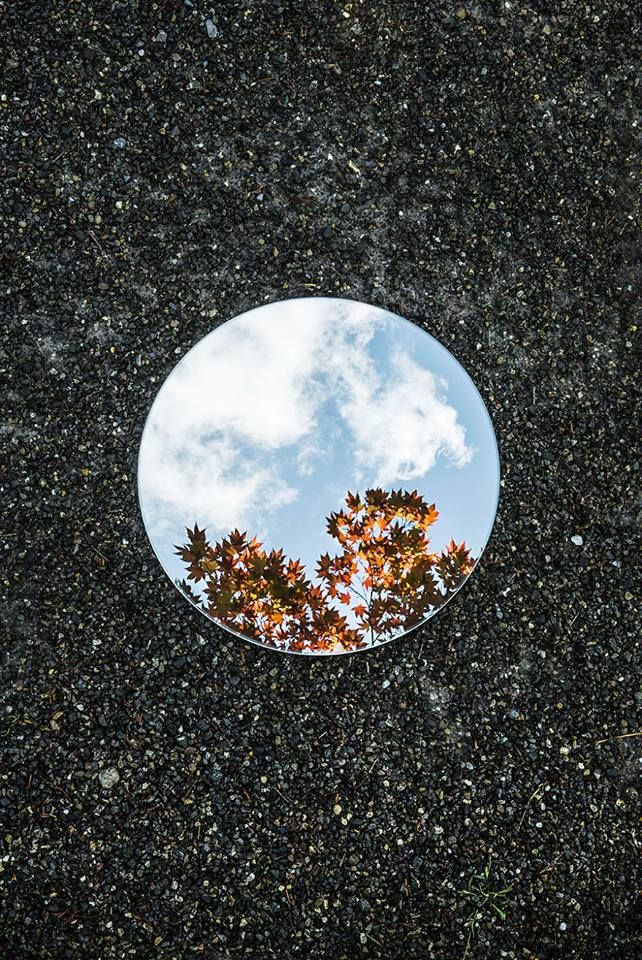
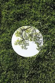
All three of theses photos show a reflection of a tree in a circular mirror on different surfaced floors and all of the mirrors are in the middle of the photo which draws your eye towards it. The image in the centre has a vibrant blue sky and an autumnal orange, yellow and green on the tree which contrasts nicely with the dullness of the black concrete floor. The angle of which the photographer took this photo i at an angle that allows him to take a picture of the mirror straight on but also not get himself or the camera in the way of the reflection. I feel as if the photographer has sharpened the mirror so therefore it is clear. Also the photographer has used natural light instead of artificial light.
GOOD ARTIST RESEARCH SECTION WITH SPECIFIC DETAILS AND ANALYSIS OF AN IMAGE.
SPECIFIY THE AIMS OF THIS SHOOT.
SPECIFIY THE AIMS OF THIS SHOOT.
My intentions for this shoot was to have contrasting backgrounds for half my images and to have a plane background for the other half so that i would have slightly different images.
|

|
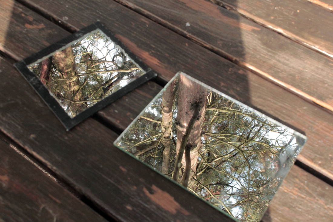
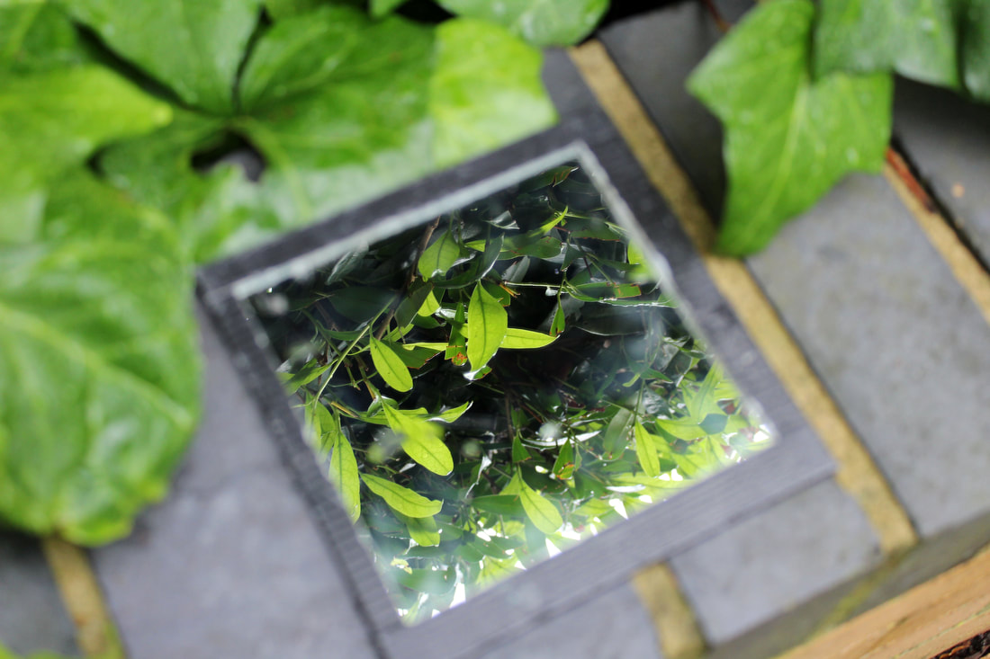
Theses are my three best images to Magnani work as they are the clearest responses. I used a mirror with black around the edges so that I will have an outline to see were the background and reflected image start and end. The image on the left consists of two mirrors therefore two reflected images. They are both of the same tree however different perspective which is more strange however intriguing. The darker shadow that takes up three quarters of the image adds contrast as there is a lot of brown in this image and is nice that there are different tones. The image on the right I also find interesting as although the background is blurry it makes the reflected more intense and clear creating a better illusion that your being drawn into the mirror. The contrasting bright green and browns is effective as it almost like I photoshop two different environments together. I feel that I could have put my aperture higher so therefore the whole of the image is in focus and is something that I will consider next time.
PLEASE BE MUCH MORE SPECIFIC IN YOUR ANALYSES OF YOUR 3 BEST IMAGES. THEY'RE GREAT (BUT NOW EXPLAIN WHY....AND WHAT YOU COULD HAVE DONE DIFFERENTLY)
PLEASE BE MUCH MORE SPECIFIC IN YOUR ANALYSES OF YOUR 3 BEST IMAGES. THEY'RE GREAT (BUT NOW EXPLAIN WHY....AND WHAT YOU COULD HAVE DONE DIFFERENTLY)
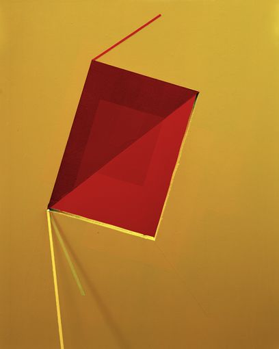
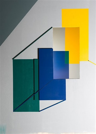
Reflection of colour
Tamara Lorenz
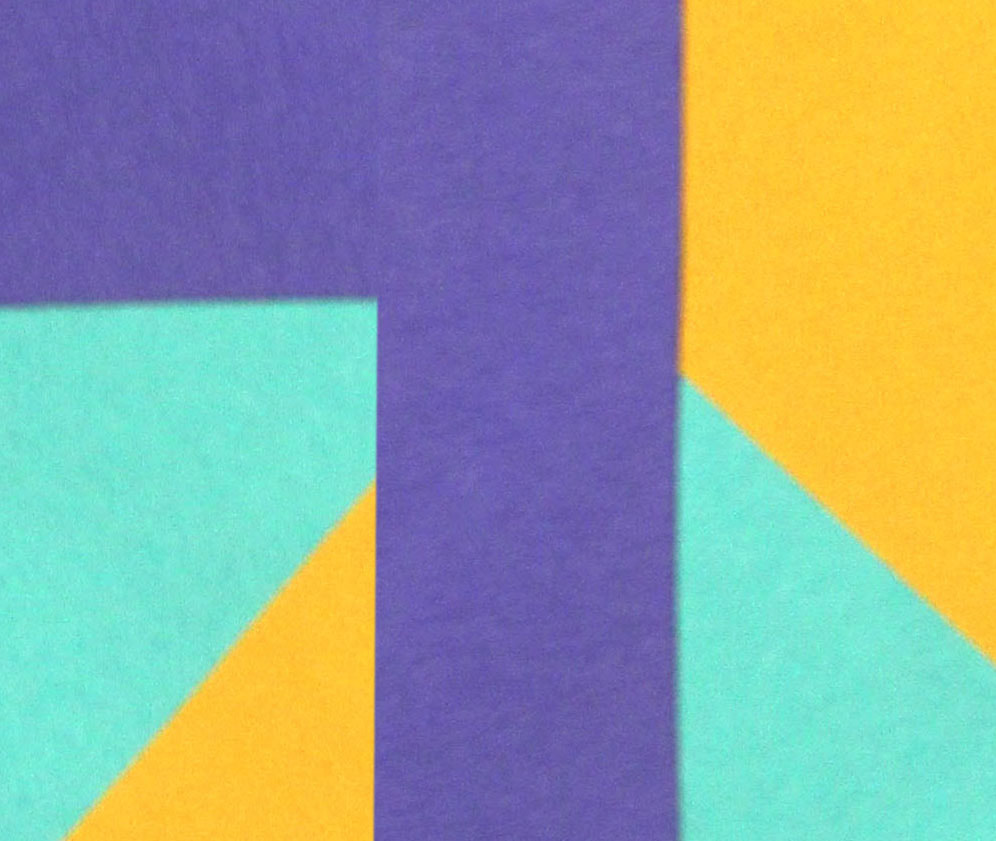
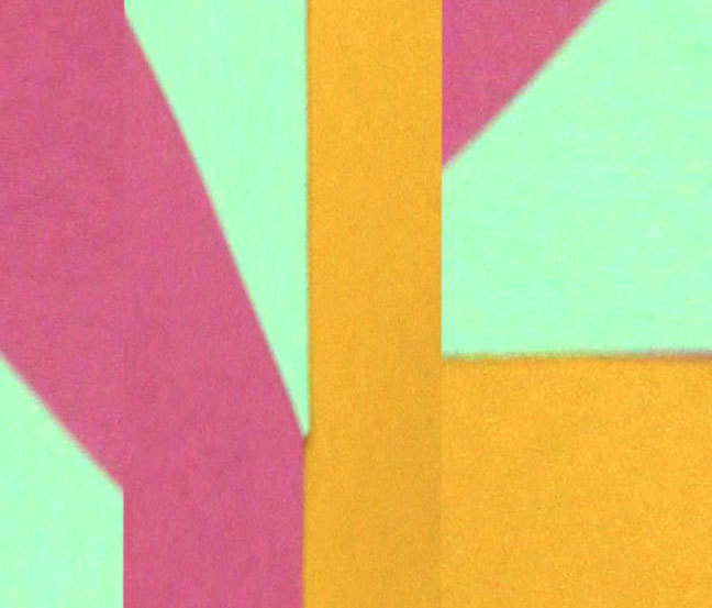
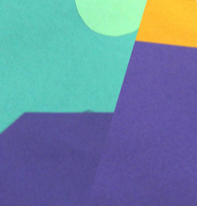
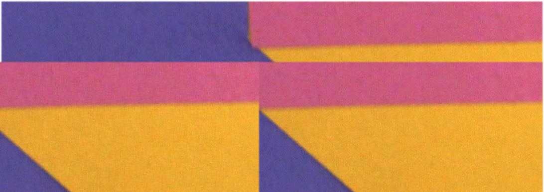
Tamara Lorenz is a German photographer that uses strong plane colours of different shapes, sizes, tones and textures to create a abstract composition with an overall pattern reflecting one another in some way. Her photos are interesting because she creates her own image then takes a photo of it almost like creating her own reality and the viewer is open to there own interpretation to the image.
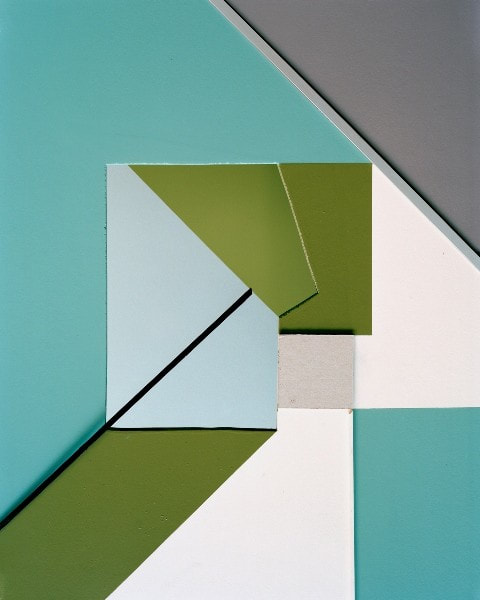
The image on the left is built up of straight lined shapes that create an irregular pattern however that look like they fit together in a strange way. The use of blues, greens and greys work well together as a whole image as they collaborate with one another. The use of the black outlines of an shape cuts the image to see what kind of shapes there are and how they link together.
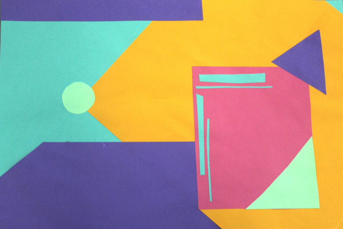
For my response I feel these colours went together well. I tried to mirror some aspects of the image but not all of it. I reflected the two light blue strips 90 degrees and played with the same colours in different orders. This images looks as if a sun is projecting a a strange image onto your eyes. I feel i could have made more shadows using darker colours with the same shape.
|
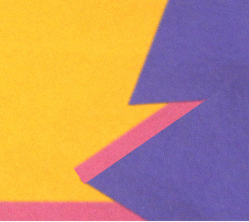
|
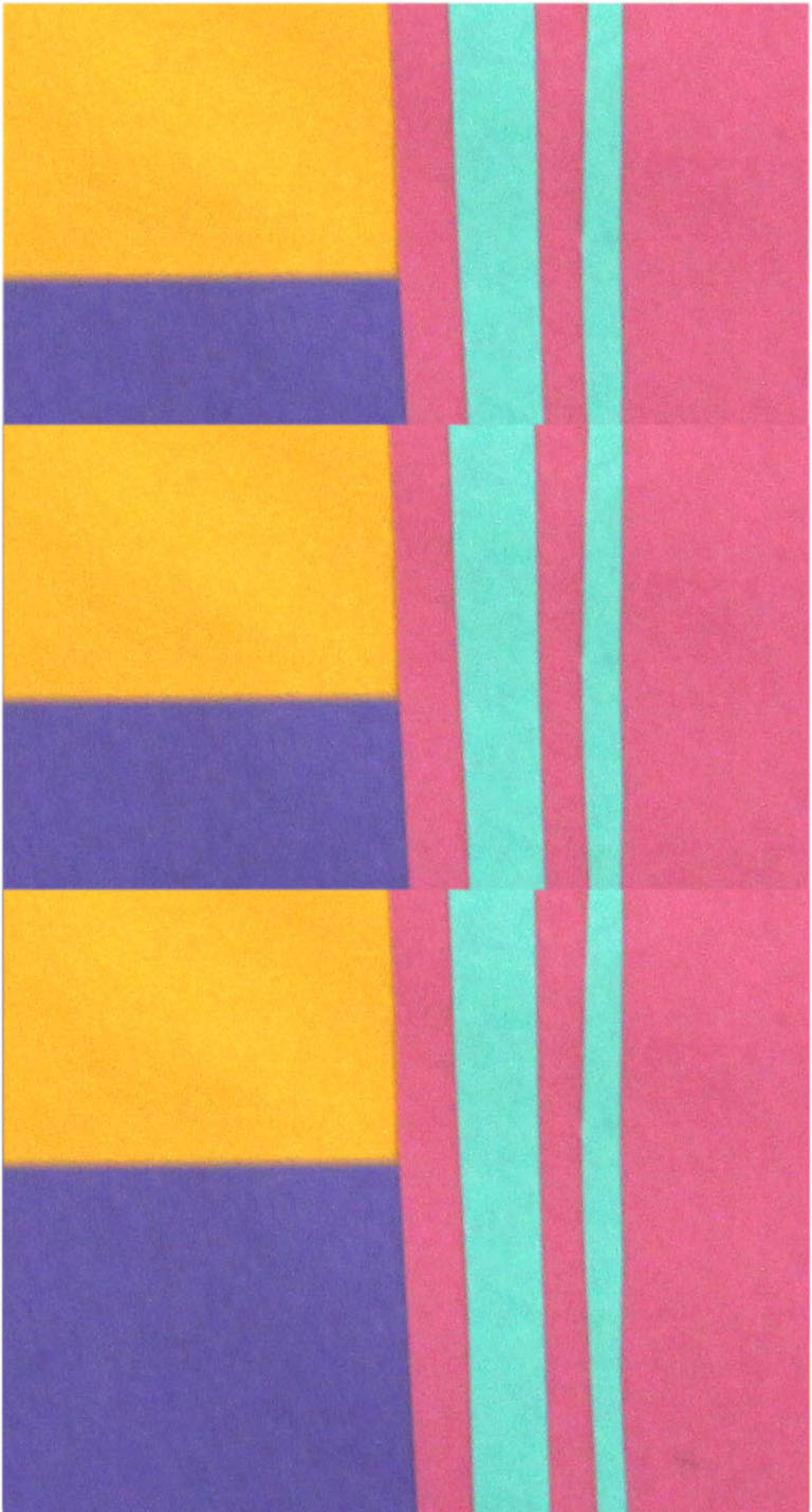
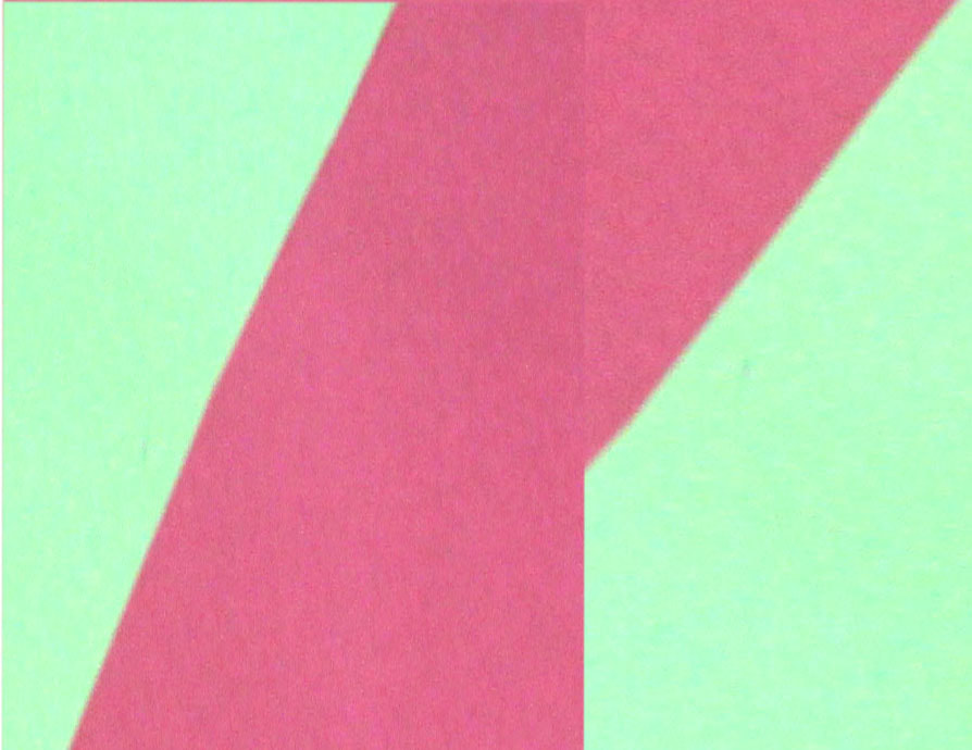
|
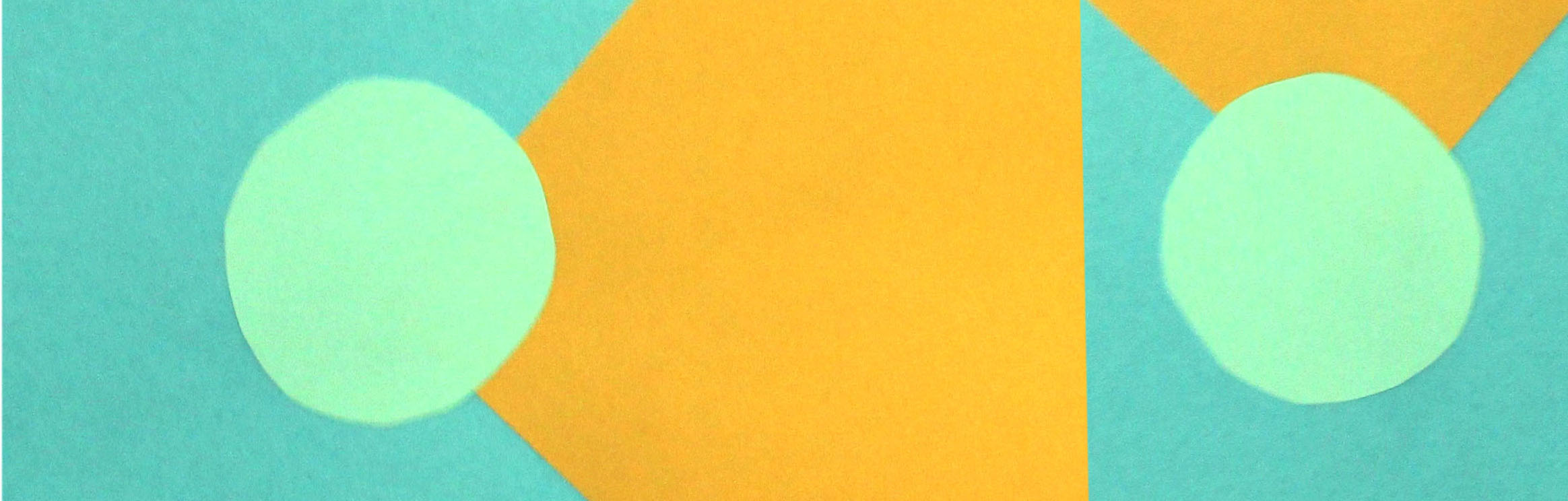
|
|
These images are all photoshopped and developed from my original photo (seen above all these developments). Theses zoomed in edits have had a mixture of duplications, rotations and enlargements to make the image more abstract and peculiar.
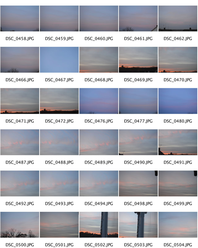
3 Strands
1/3 Reflection of the sky
Jerry McElroy
Jerry McElory is a California photographer who started his photography career at age 18, after graduating from university. Not only is McElory a photographer but a artist as well. He studied both and has been doing well for 25 years. His work has been featured in in many different types of media, for example book covers, magazines and advertisements. Most of his paintings centre around deserts and exploring seascapes.
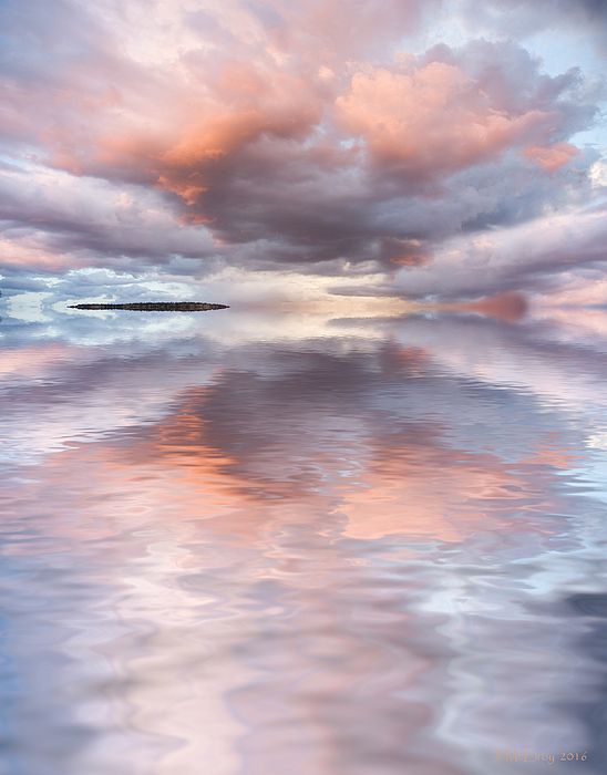
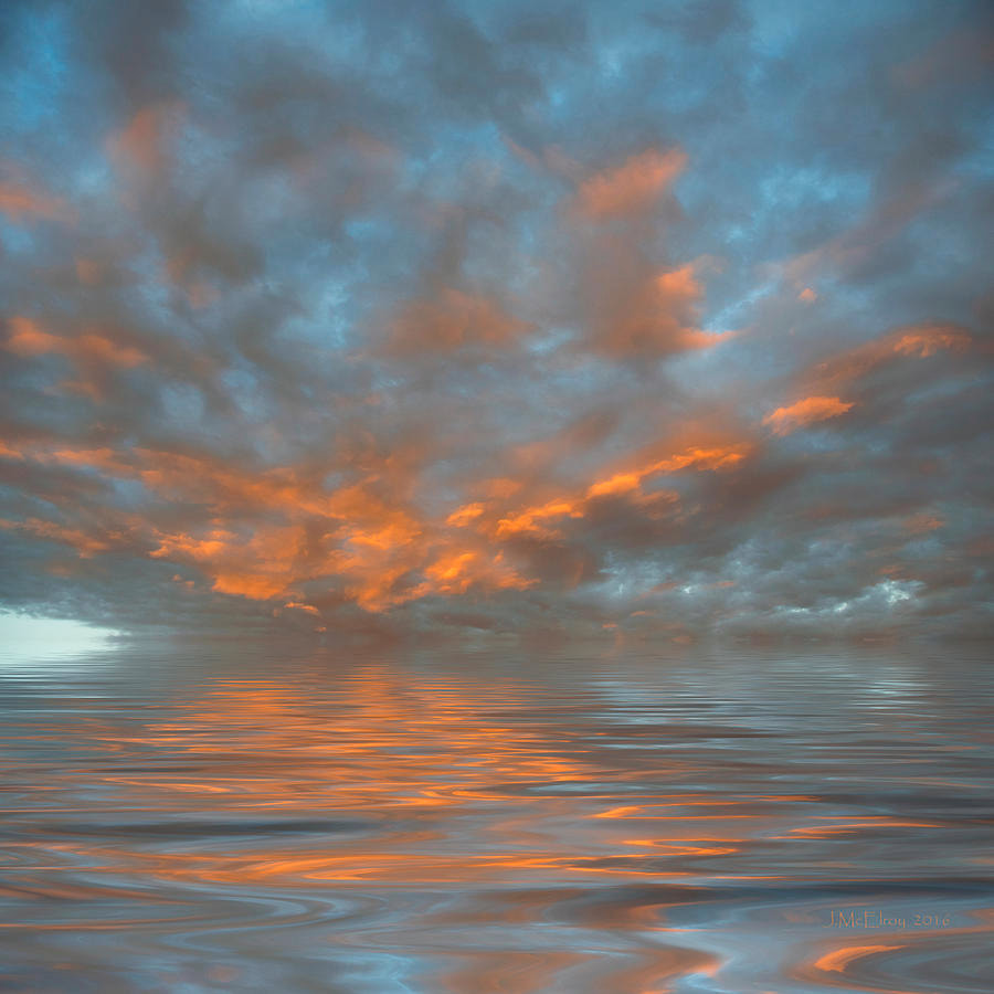
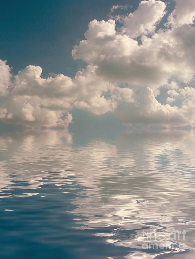
McElroy creates fantastical images by reflecting the sky or a pleasurable sunset onto open water. The refection in the water clearly shows the colours of the sky nicely however are blurry. Each photo has a different point at which the horizon is at, this either creates more of the sky or more of the mirrored blurred image. My favourite image is the one on the left as I feel the colours are muted creating soft tones to the image. Your eye is drawn to the narrow black line to the top left of the image which I feel ruins the tone of the image as it makes the image look no symmetrical as the line is not reflected into the water unlike the other colours.
|
|
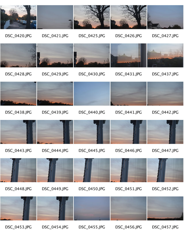
Instead of reflecting the sky into water I have chosen to reflect the sky itself. My intentions for this shoot is to take photos of the sky and flip them upside down so it looks as if you are walking on the sky instead of looking up at it.


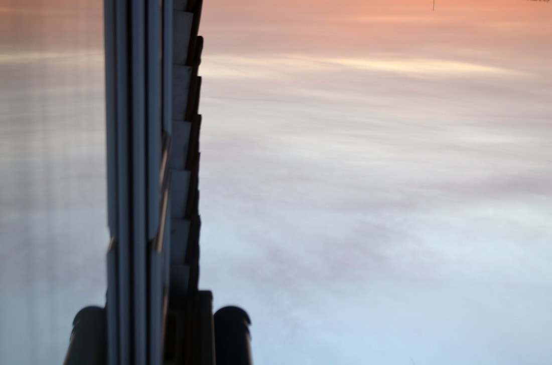
These are my 3 best images as when i rotated them 180 degrees which in some ways you if you don't know they were rotated you wouldn't necessarily know they were rotated however if you looked at the images more closely you would see that they are. I like the colours i used in this shoot as they blend well together. Each of these images are the same sky just different directions as in each direction (north, south,west,east) there was a different tone and sky. I then photoshopped my images to make the colours more vibrant and noticeable. The first two images the sky is perceived as quite nice and light however the image on the right is light blues and greens however there is a lively reddy orange.
2/3 Shadows
Pol Ubeda Härvas
Pol Ubeda Hervas uses photography to express his feelings. He said that he doesn't recognise himself anymore so he uses shadows in his images but he erases the body, because he still doesn't now him self. But he keeps that shoes to make sure theres more than a simple shadow. He names his series `'I'm not there'. This has a very effective title as shadows are reflections of yourself or things when the sun reflects of it. I think his work is simple but very effective because as he quoted 'How can we accept that we are changing? How can we accept we hardly recognise ourselves in certain." There is a lot of truth in what Hervas says and it shows this in a photo form.
All three of theses images show a reflection of a man however the man is not there it is just his shoes. This has a powerful effect on the viewer as it looks as if it is an illusion and contains a sense of mystery as there is no man just a figure. The image on the right is a plane image in terms of colour however looks as if this figure is rising up creating a ghost like image. I like the way the image is reflected on to the wall instead of ground as it looks more intense and frightening because you can see the figure as a whole and as the figure is on a clear and smooth background the image is in more detail which making the image as a whole better.
This is the process in which i edited my images in photoshop.
|
|
I enjoyed this task however I am disappointed that I had to use a trouser leg to make up the rest of the left shoe as I positioned the camera wrong but it is something to contemplate next time. In saying this I feel that the composition as a whole worked really well apart for the left leg because it achieved my intention which was to capture just a still figure. The cracks in the ground add more of a sense of horror to the image making the image look like a crime scene also due to the yellow lines drawn on the ground.
|
|
Final Piece
For my second response I refined my work by using the same concept however I used the model to fade into the surroundings creating a more ghostly image and creating a mystical effect and feel. I used the same location but instead took the image where the ground was a lighter background therefore I could capture a more clear and darker shadow. The different colour chairs contrast with the surroundings and add more colour and objective to the image.
EXCELLENT JOB! GOTTA SHOW YOUR EDITING IN PHOTOSHOP AND INCLUDE WWW AND EBI.
INCLUDE AN ARTIST RESEARCH SECTION ON TOM HUSSEY HERE
BELOW, SHOW YOUR SCREENSHOTS IN PHOTOSHOP THEN, WWW AND EBI PLEASE.
BELOW, SHOW YOUR SCREENSHOTS IN PHOTOSHOP THEN, WWW AND EBI PLEASE.
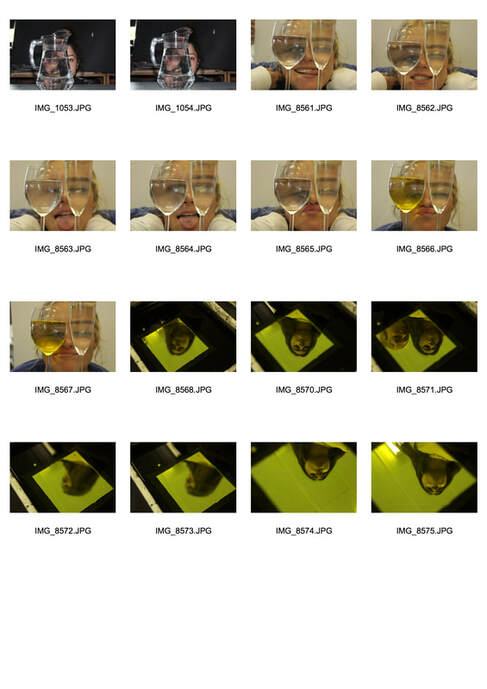
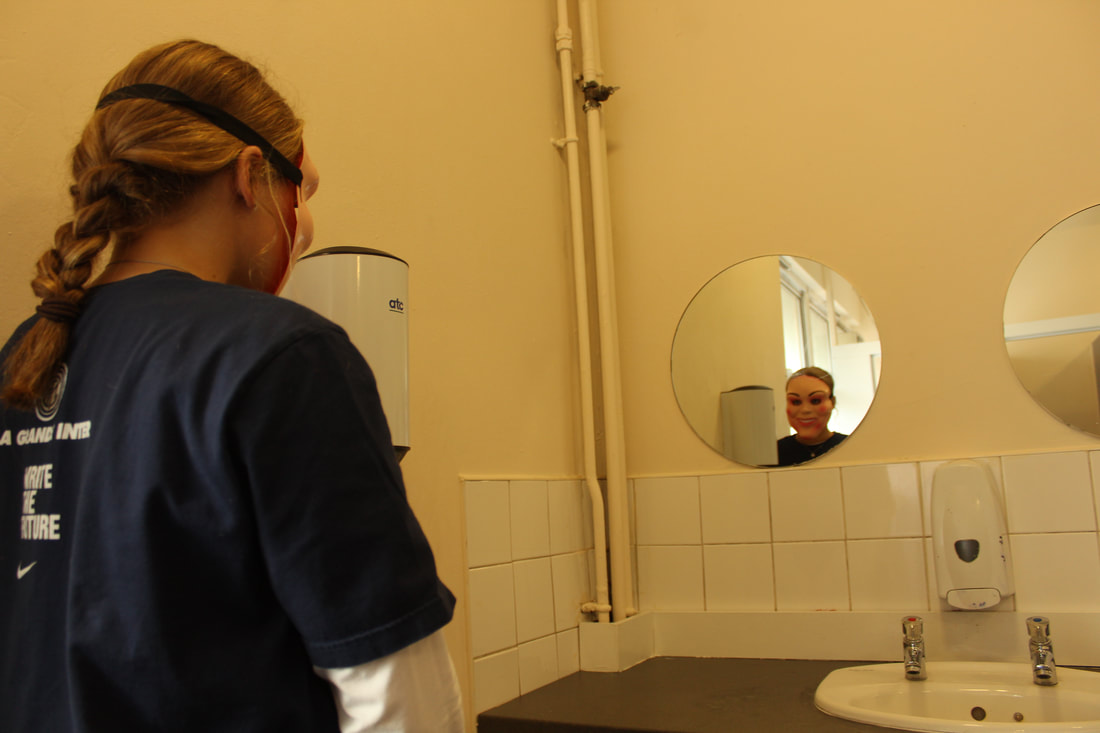
3/3 Self reflection
Tom Hussy
Tom Hussey is an American photographer who specialised in commercial advertising and lifestyle photography. Hussey's images have a deep and meaningful intention that he creates in his images between young and old. This has a powerful emotional effect as it shows elderly people and what they used to look like and do as there jobs they all have a clear contrast. I like to use Hussey as my main inspiration as he shows a story in his images.
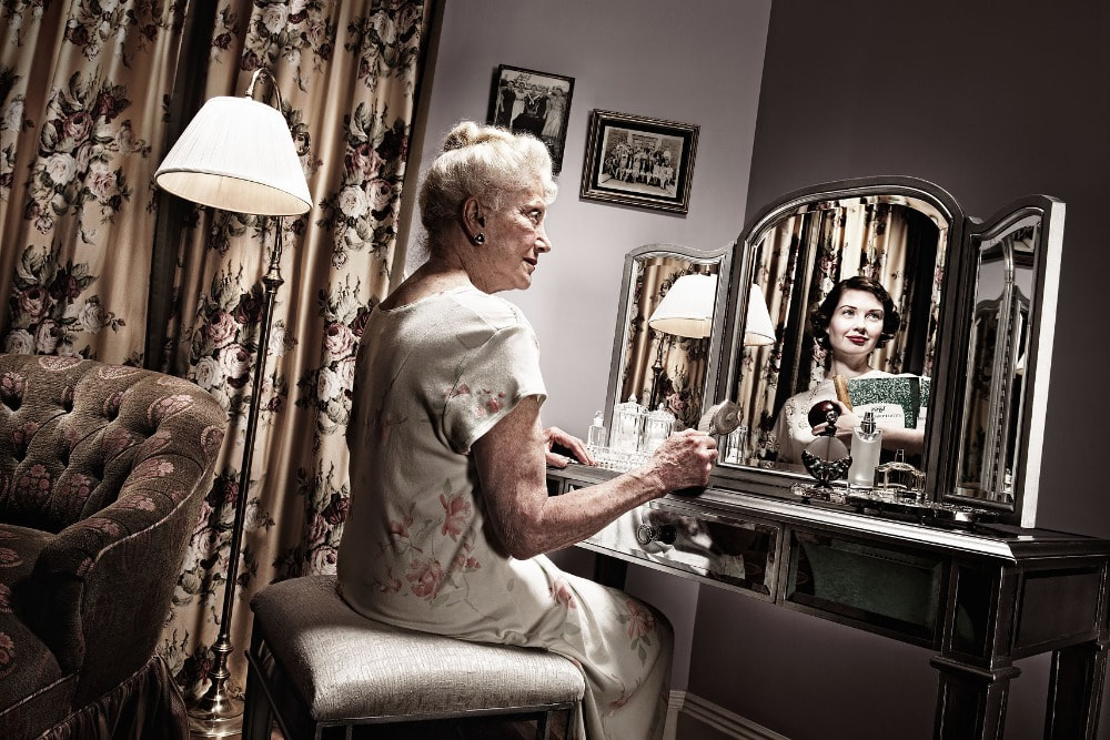
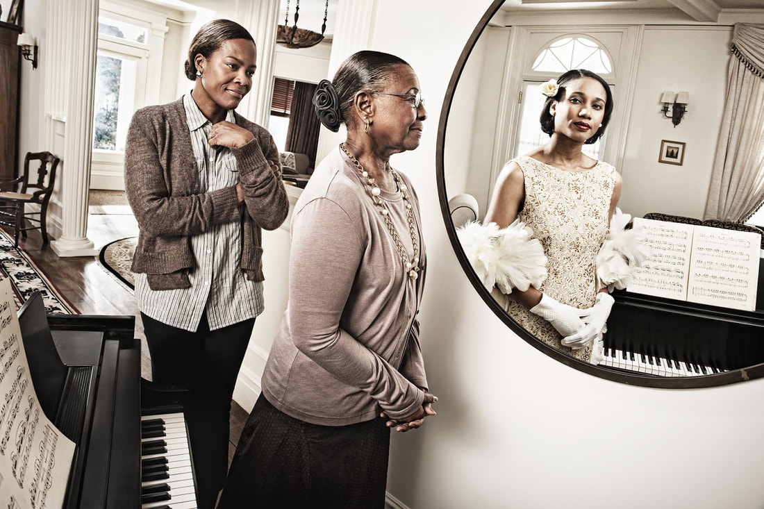
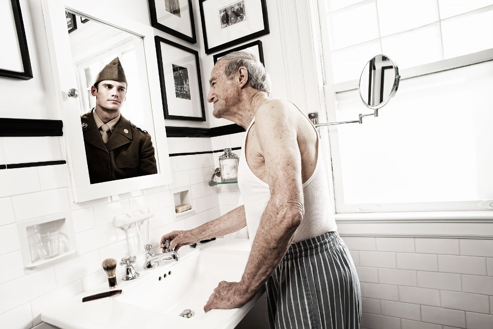
I like Hussy's images as every image has an own personal connection to a different person. The image in the centre consists of an elderly women looking into a circular mirror that has been structured the same way as the non reflected image, this is shown by the piano. This image is clever as the way the men is standing is the same way that her younger self is standing. Also the fact that there is another women behind her which the viewer can only assume is her daughter creates another emotional response to the viewer.
First Response
|
|

For my response I decided to do a negative response instead of a positive one represented through Tom Hussey's work. This image creates a cold and fearsome feel to the viewer as its as though the models inner demon has emerged trying to take over her body or either is showing her true colours. I feel this image can have many interpretations and that its one reason why it's appealing to the viewer. The image is underexposed therefore creating a non welcomed yellow lightning that I wil refine in my second response.
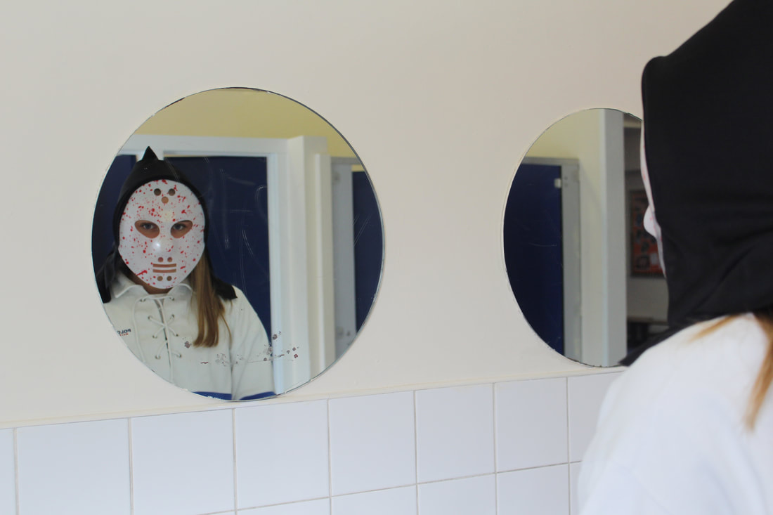
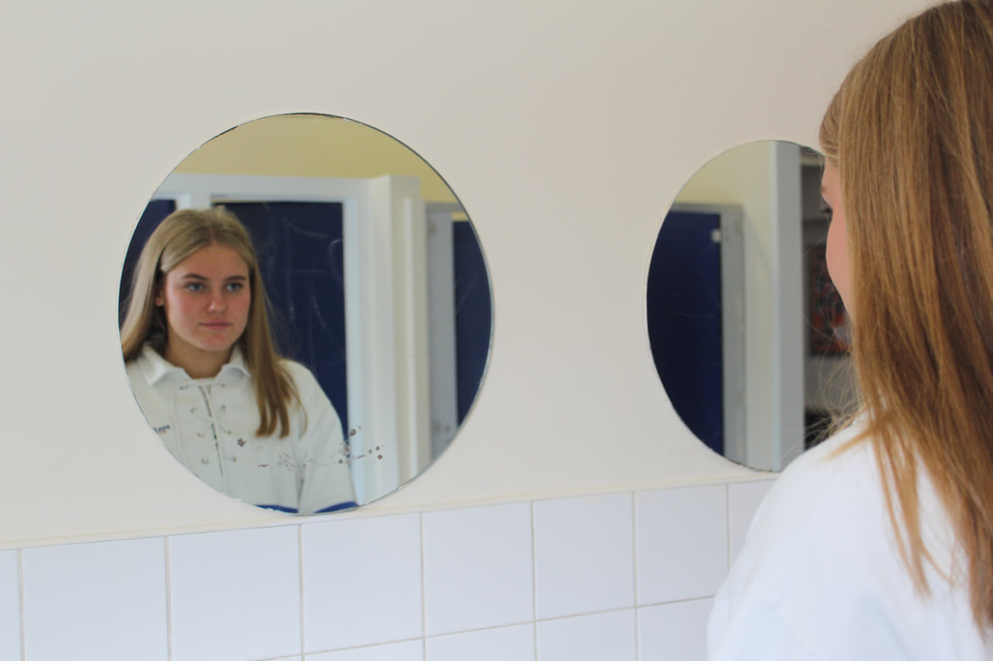
Second Response
This is the process in which I edited my photos in photoshop.
|
|
Final Piece
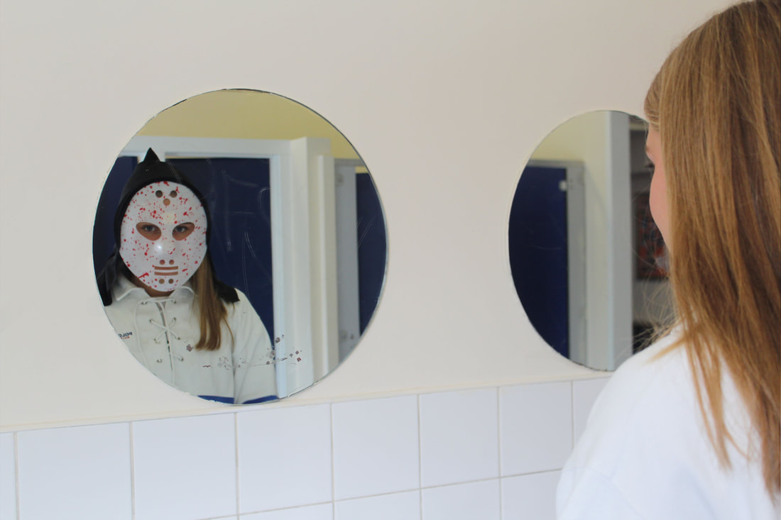
This is my second response to self reflection and I feel that my final image is better than my first as the colouring is better and that it is more clean in the sense that u can clearly see the subject without a mask and can clearly see her with a mask through the reflection in the mirror. I used a tripod that made my image look more successful as there was no camera shake so therefore there was no difference in the two images so i could photoshop them together nicely. This image reflected my intentions which was to capture a
Moodboard

1st Development
Kumi Yamashita
Kumi Yamashita was born in Takasaki, Japan. She went to Glasgow school of art and received her Master of Fine Arts Degree. Currently she works and lives in New York. Yamashita shows her work through exhibits internationally. She is best known for her pieces of work to do with refection where she takes objects and finds ways in which to rejected them through mirrors.

|
|
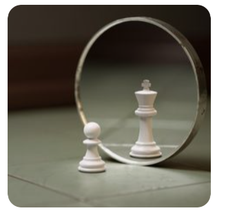
I like both of these images as not only are they both very creative but both are powerful in which ever way you interpret the images. The image on the right is a reflection of a prawn looking into a mirror and seeing a king which could symbolise either himself or a male role model. the composition of the image as a whole is lovely as everything thats not the mirror and the prawn is slightly blurry and simplistic in order not to distract the viewer from the central focus of the image.
For this development I have chosen chess pieces in order to show reflections.This idea is a development and combination on from Tom Hussy's work and Kumi Yamashita.
For this development I have chosen chess pieces in order to show reflections.This idea is a development and combination on from Tom Hussy's work and Kumi Yamashita.
First response
|
|
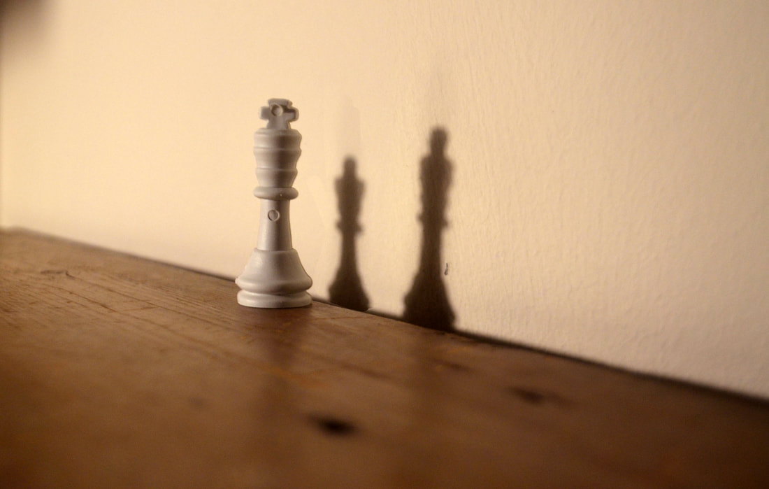
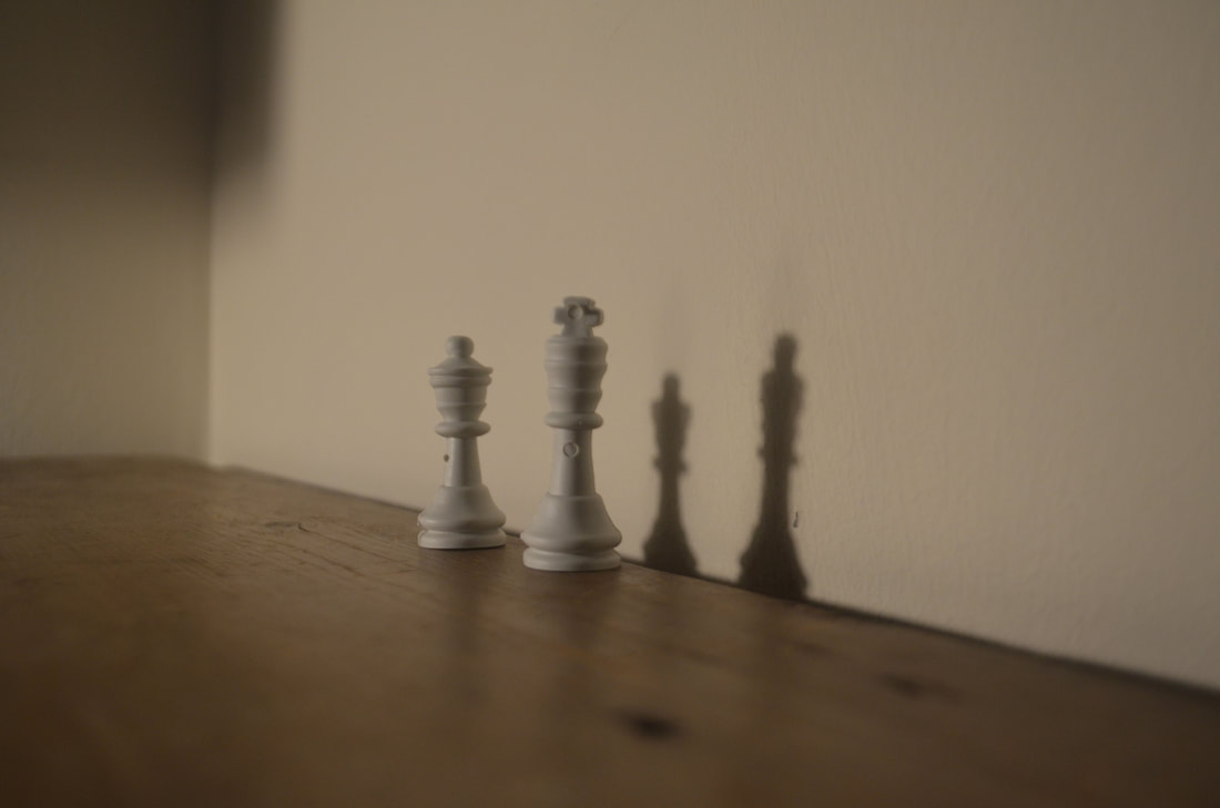
For my first response i used a tripod so that i would avoid camera shake so that the two images would line up perfectly. I used a powerful light in order to capture a strong dark reflection. I also put the chess pieces as close to the wall as possible to get a more clear outcome. I used a king and a queen chess piece. My concept for this shoot was that the king symbolised a man and husband and the queen symbolised a women and wife to the king. I then edited the two images so that there was just as shadow of the queen and not a figure. This represents the wife as being dead and the man reflecting on his dead wife. I like this shoot as it I think its a gripping image.
Second response
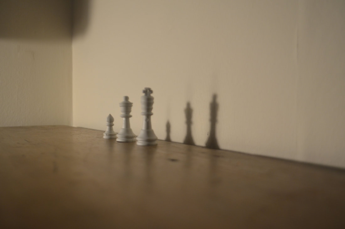
|
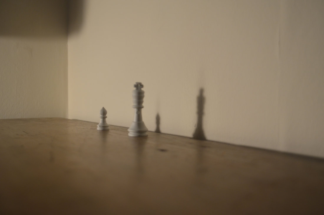
|
Final Piece
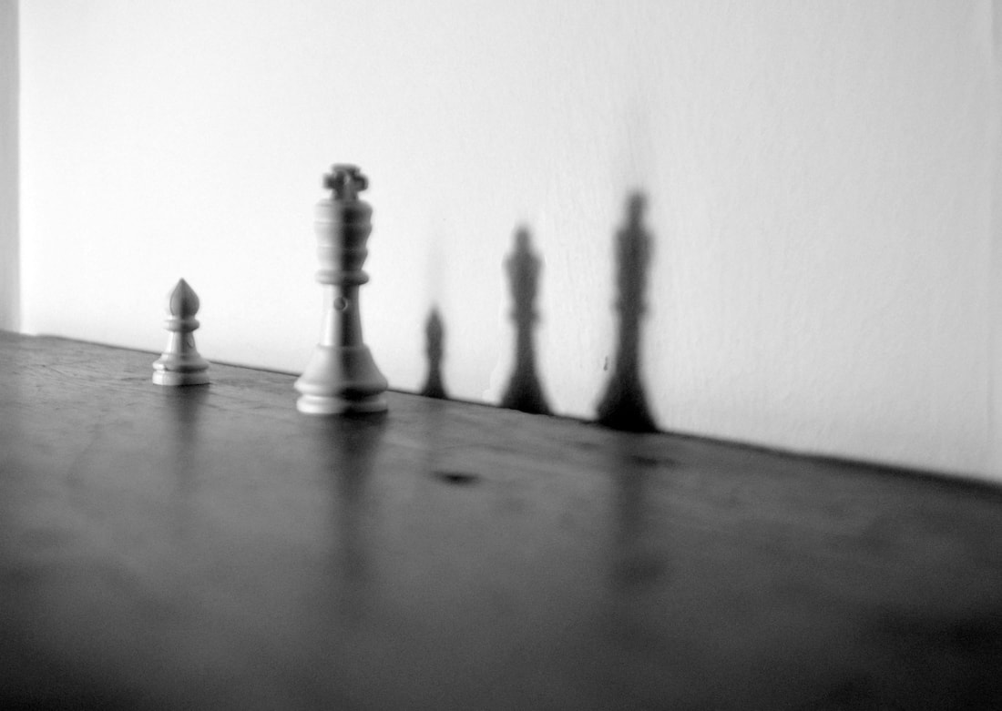
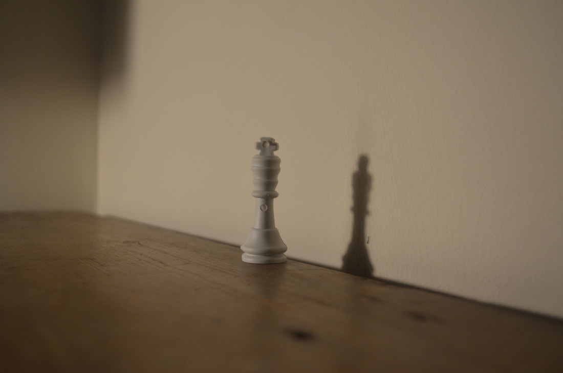
For my second response I tried to go deeper into my interpretation of my last image and add a child which is represented as the prawn so now that the women is not only a wife but a mum as well. To make this image have more of an impact I decided to turn the image into black and white so therefore adding extract sorrow and sadness to the image.
2nd development
History of the silhouette
"portraiture was the popular way to recreate an image of oneself or loved one before the invention and common use of photography in the mid 1800's. During the years of 1500 and 1860, professional and amateur artists would either paint or cut profiles – using paints or scissors."
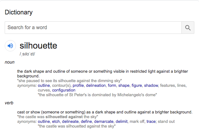
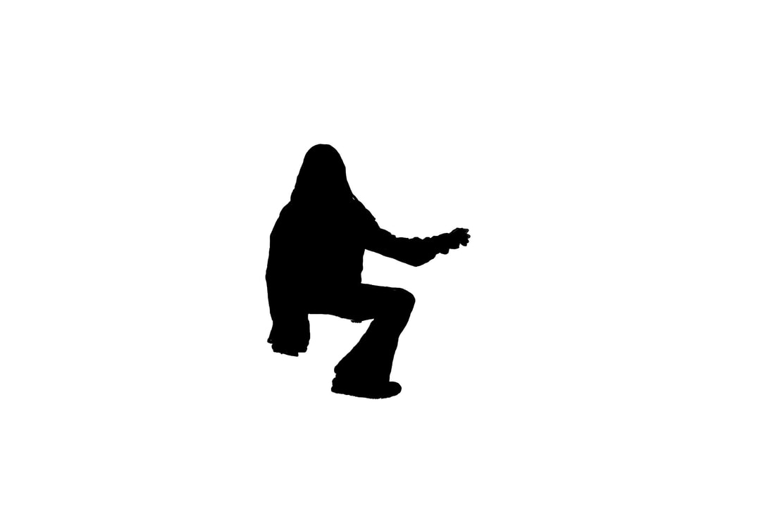
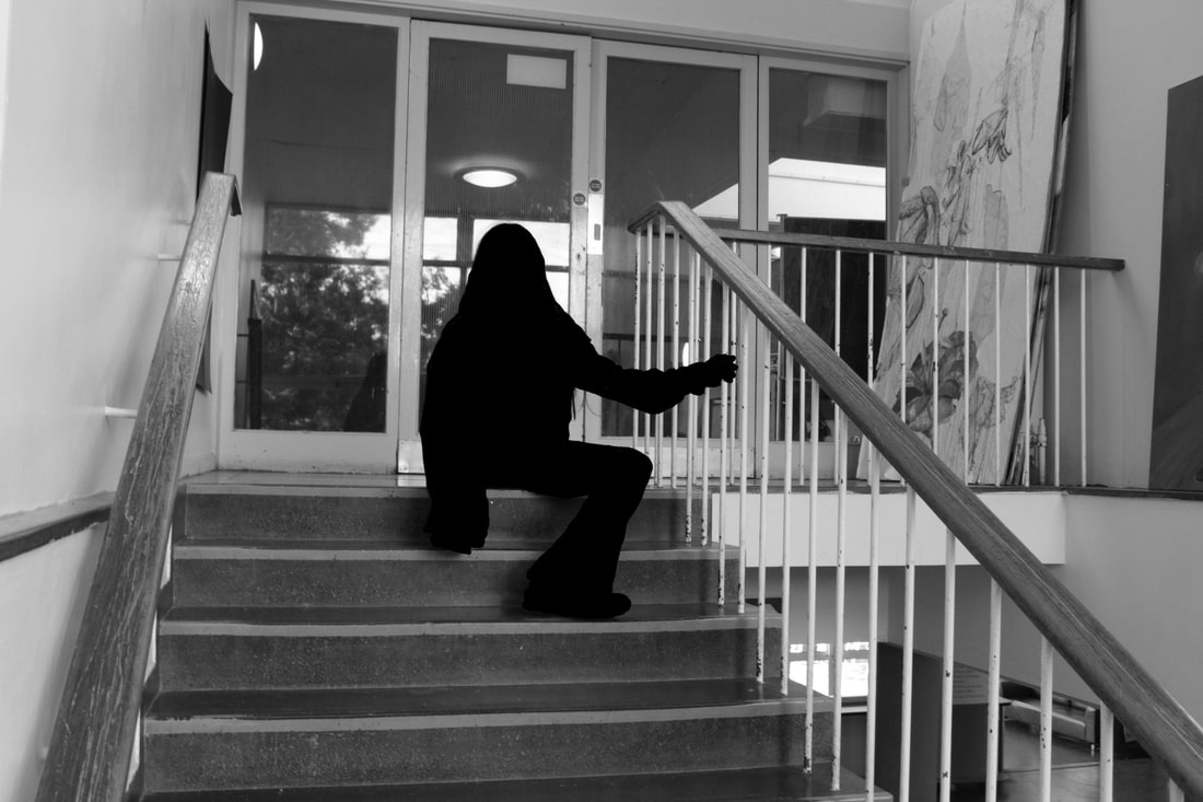
Kara Walker
kara Walker is an American silhouettes, print-maker, painter and installation artist. Walker studied in Rhode Island School of Design where she learnt art and found her love for it. She explores gender,sexuality,race which covers an overall theme of "identity" in her work which she largely concentrates on. Walker is best known for her massive black cut-paper silhouettes.
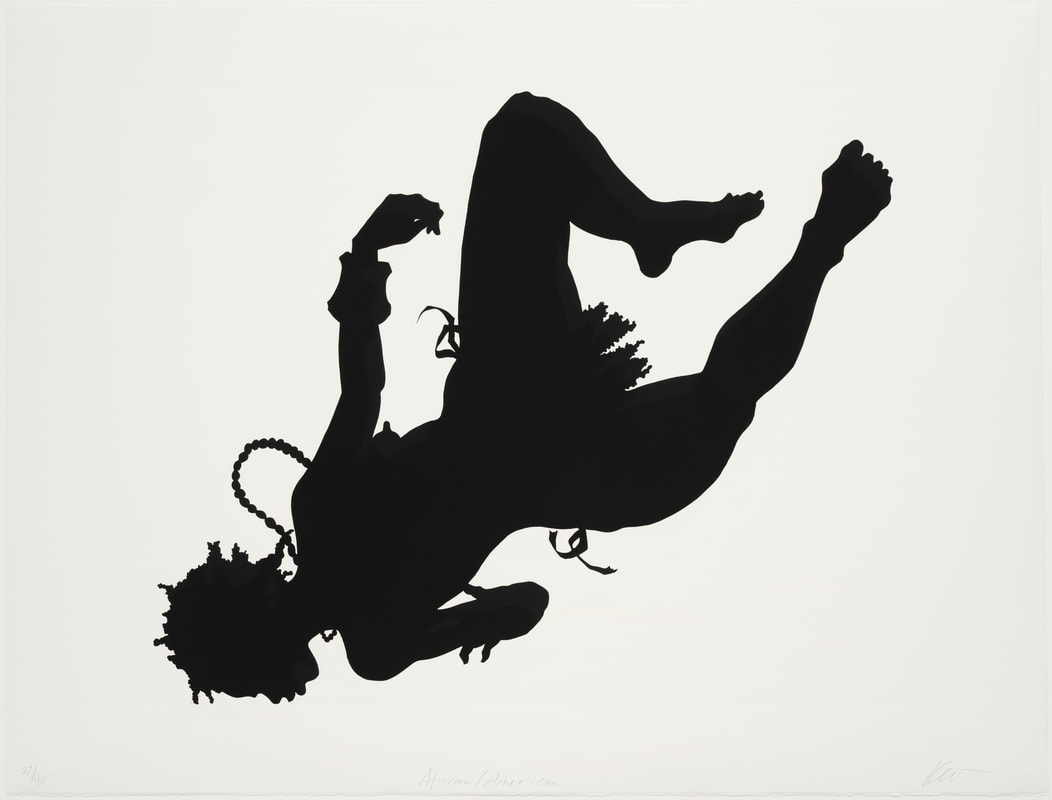
Walker uses dark black Silhouettes to create stories and powerful images. The image in the centre is a beautiful scene of a man kissing his wife leaving looking as if he his going away on a boat. This images is simple but pays a lot of attention to the fine details and looks quite spooky upon first glance. My intention for this shoot is to capture a reflection onto a wall that looks as if it is a silhouette.
|
|

This final response is trying to represent walkers work. I did this on photoshop by colouring in the figure and making it as if she was a silhouette. My response is a silhouette although I feel I could of made more of a scene with my image so that it didn't come out so plain next time I will improve this
Hayley Warnham
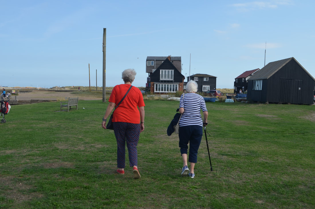
Hayley Warmham is a English Photographer who has worked on a many projects which have all been quite successful including the ICON Magazine, London Transport Museum. This series is titled "Everything is beautiful" as Warmham brings old black and white photo's back to life by adding colour to them sending an amazing message to say that the good, bright things in life are always around you.
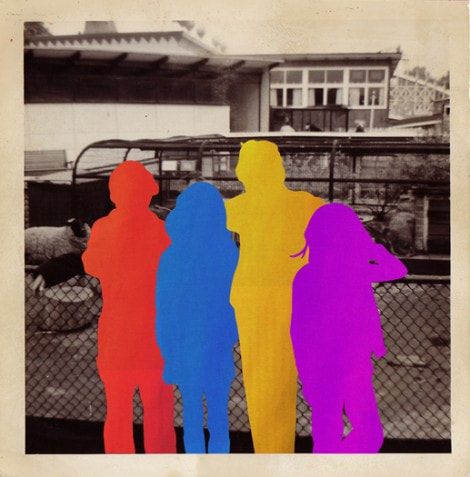
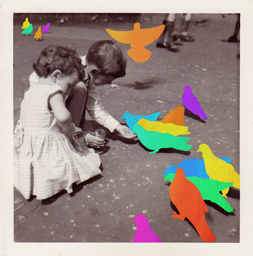
Hayley Warnham creates coloured flat shapes and silhouettes in order to have a sharp contrast between light and dark. This contrast is unmissable as theses bright blocks of colour highlight the significant part of the image. I like her images as I feel that they are creative in spotlighting the pleasure and happiness in an image. This is interesting as it could be interpreted that the coloured image is not actually there and could be someones memory or wish.
First Response
|

|
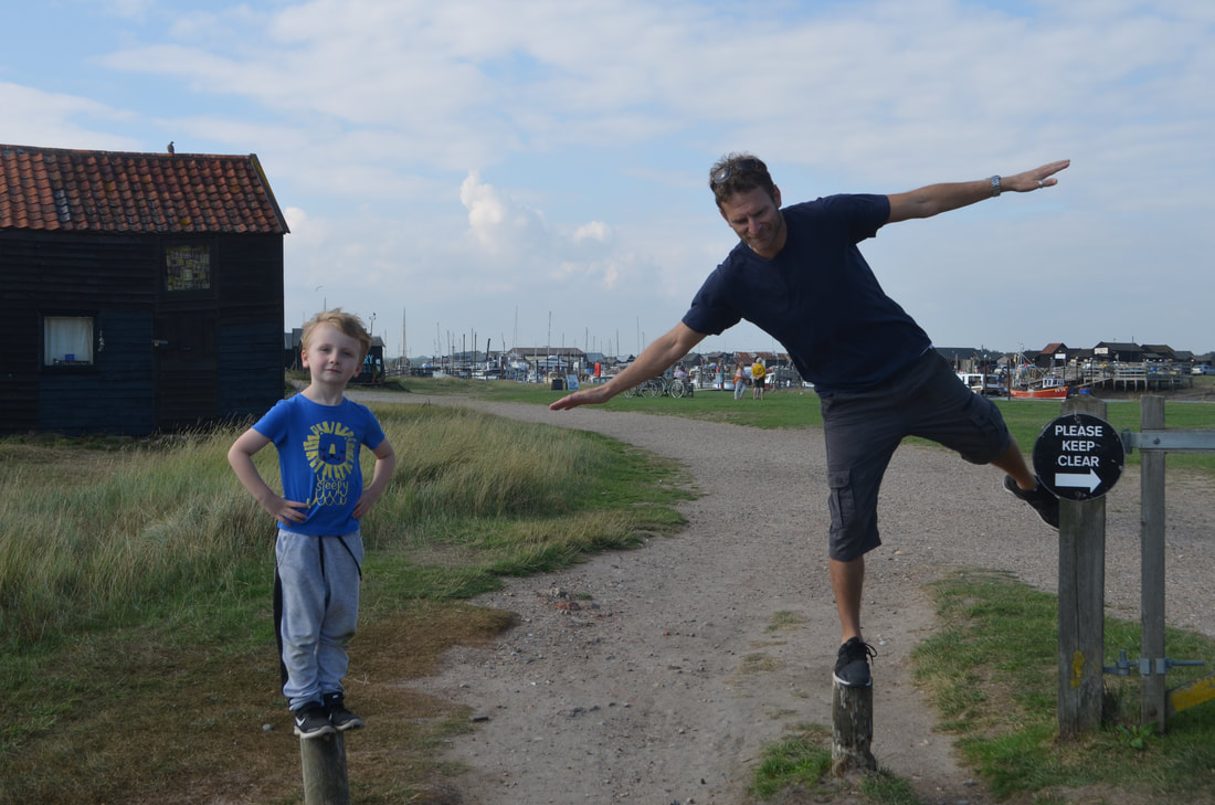
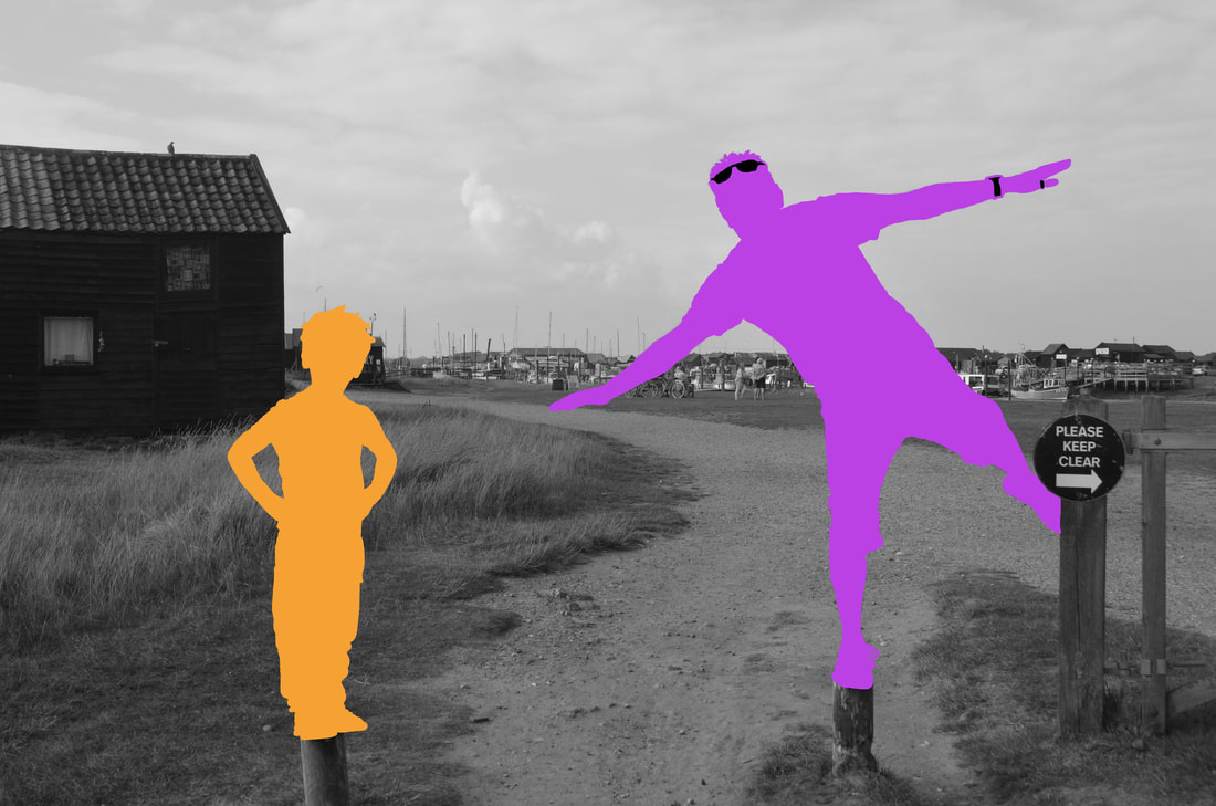
My intentions for this shoot is to capture a happy or family image to then block out a person or people as if they are not there so it looks as if the viewer is reflecting on a memory of what once was.
My first response as shown I didn't colour in the figure completely as it wouldn't of looked like a person so therefore I left it half coloured in which I don't mind as if I refer back to my intention it looks as if the memory is fading away instead of reflecting on a memory this viewer is reflecting on a memory that is slowly diving away. Although I can still relate this back to my brief I'm going to do a second shoot to capture my first intention.
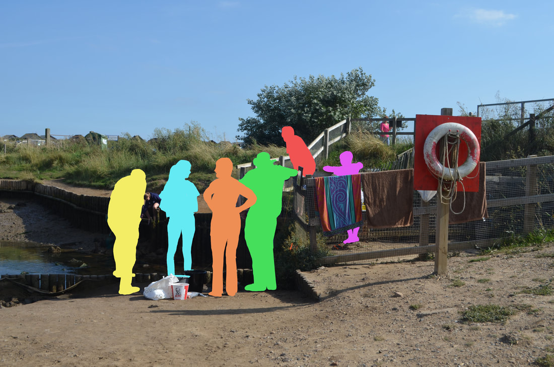
My Second Response
|
|
|
Final Pieces
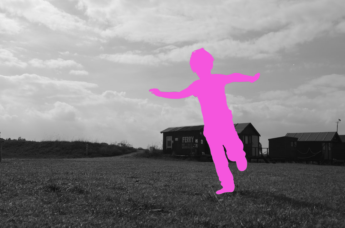
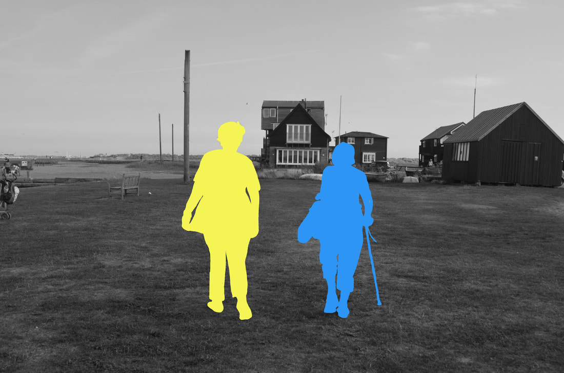
These three images reflect my intentions perfectly. I used a different colour for each person and made theses three images line up well so they that they all show a memories of a day out alone a harbour. The image before the where of people having a good time. When I blocked out the people with colour it takes away any emotion that the image had, so it is unknown of what the feel off the image was so therefore it is up to the viewers interpritation to decide what it is or if any. What went well was my editing as I had to draw around my subjects and fill them in with colour.
Final piece
|
|
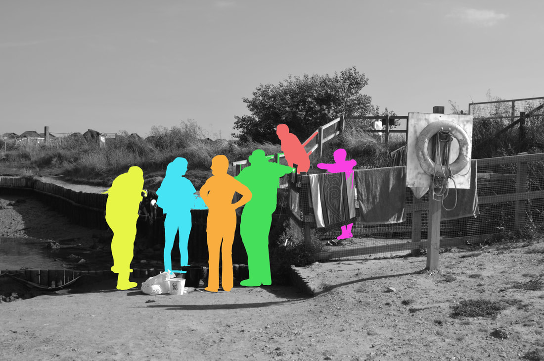
For my final piece I developed a whole family instead of two people or one and they all have a different colour and all have a different position in which they are standing. I choose these colours as I feel that they work well together and contrast well with the grey background. The grey background represents a past memory that someone is reflecting on and the people in the image are part of the memory but its a little faded therefore the view can't see there faces or there emotions that is why the colours are blending into the background giving the image a impression that its fading away. I feel this project went well as I followed my intentions.
Katya - enlarge your image of Fleur behind the wine glasses and maybe go further in and edit it and turn it black and white so it resembles the work of Antonio Guttierez a bit more. Remember to respond to all of my red feedback.
Go through and proof read all of your work to ensure that it makes sense and make corrections where necessary.
Enlarge your best images from each section - right now having 3 next to each other looks good but doesn't really show the details of the images.
Go back to your paper cuts to your Reflections of Colour - what I would like you to do is make several different examples where you crop the image in different places and then, rearrange them so you have several different compositions that are made up from the larger composition. These can be rearranged, turned around and flipped over, really going for the idea that you are reflecting parts of the image onto itself.
For your chess piece section, I would like you to look at the work of Kumi Yamashita and include the following images as part of your research.
As a transition into your Hayley Warnham-inspired images, why don't you create some that are just plain silhouettes - making ordinary photographs where you create a scene with some of your friends. Take the photographs that you then turn into black and white and you make the subjects into black silhouettes.
